Branding
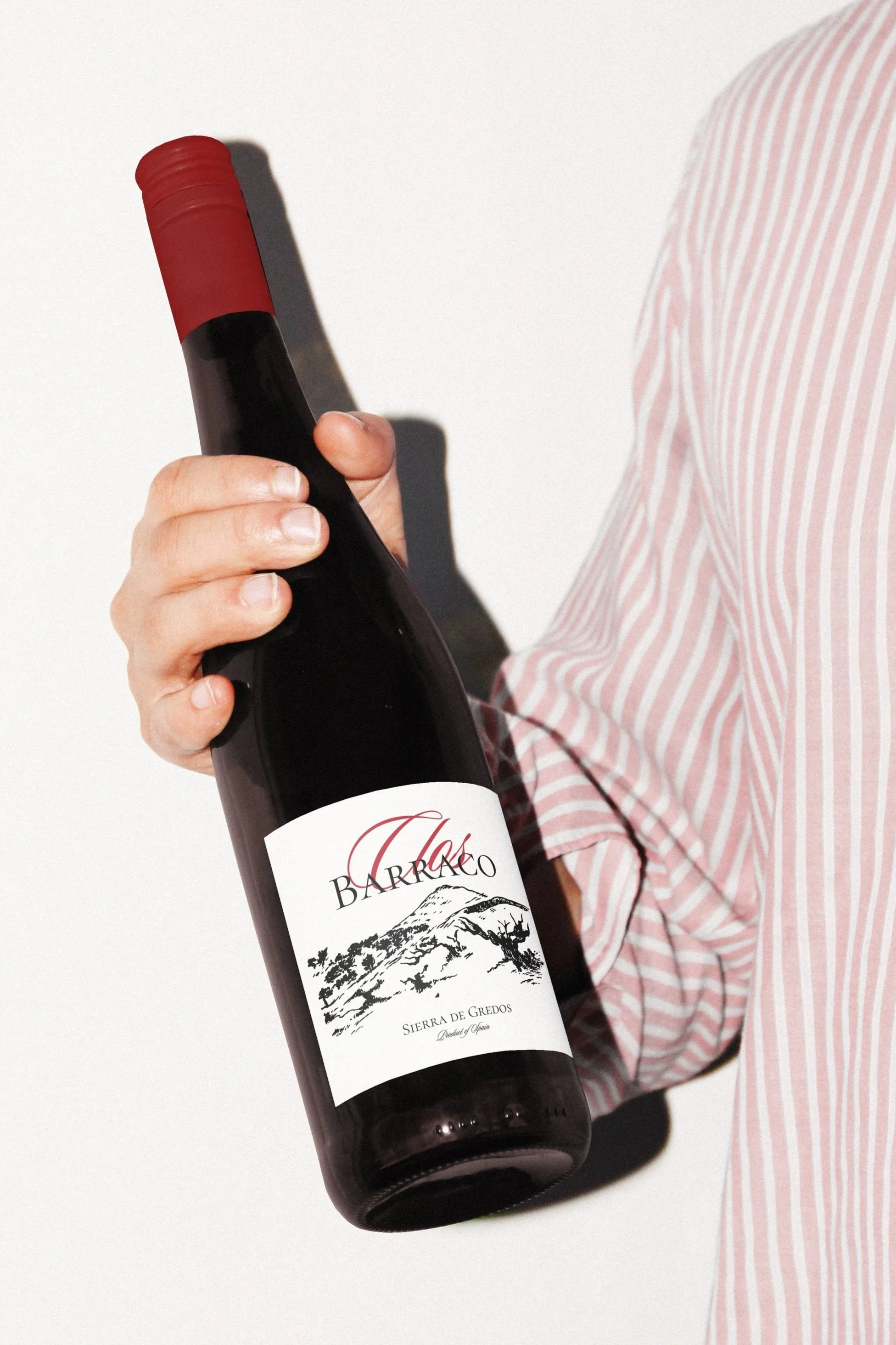
Clos Barraco
Clos Barraco is a project born from a group of French friends and wine enthusiasts who decided to bring their passion to Spain, acquiring a small vineyard parcel in the Sierra de Gredos to produce their own wine.
They wanted a label that would capture the essence of their story, a blend of French sophistication and raw Spanish beauty. The result is a design that feels timeless yet modern, balancing elegance and authenticity.
The handwritten “Clos” in deep red adds a sense of warmth and intimacy, while the black-and-white illustration of the vineyard evokes craftsmanship and respect for tradition.
Together, these elements reflect the dual identity of the brand: French in spirit, Spanish in soil.
Wine label design

El sorbo x Peter in Florence
Branding contest winner
El Sorbo, a Spanish cocktail brand, and Peter in Florence (PiF), an Italian gin brand, collaborated on a Gin Basil product to enter each other’s markets.
The goal was to preserve both brands' identities in the design, allowing consumers to recognize elements of each brand.
The colors were kept simple and mature, reflecting PiF's aesthetic, with a pig symbol subtly nodding to PiF’s branding. The overall illustration style mirrored El Sorbo’s youthful design approach.
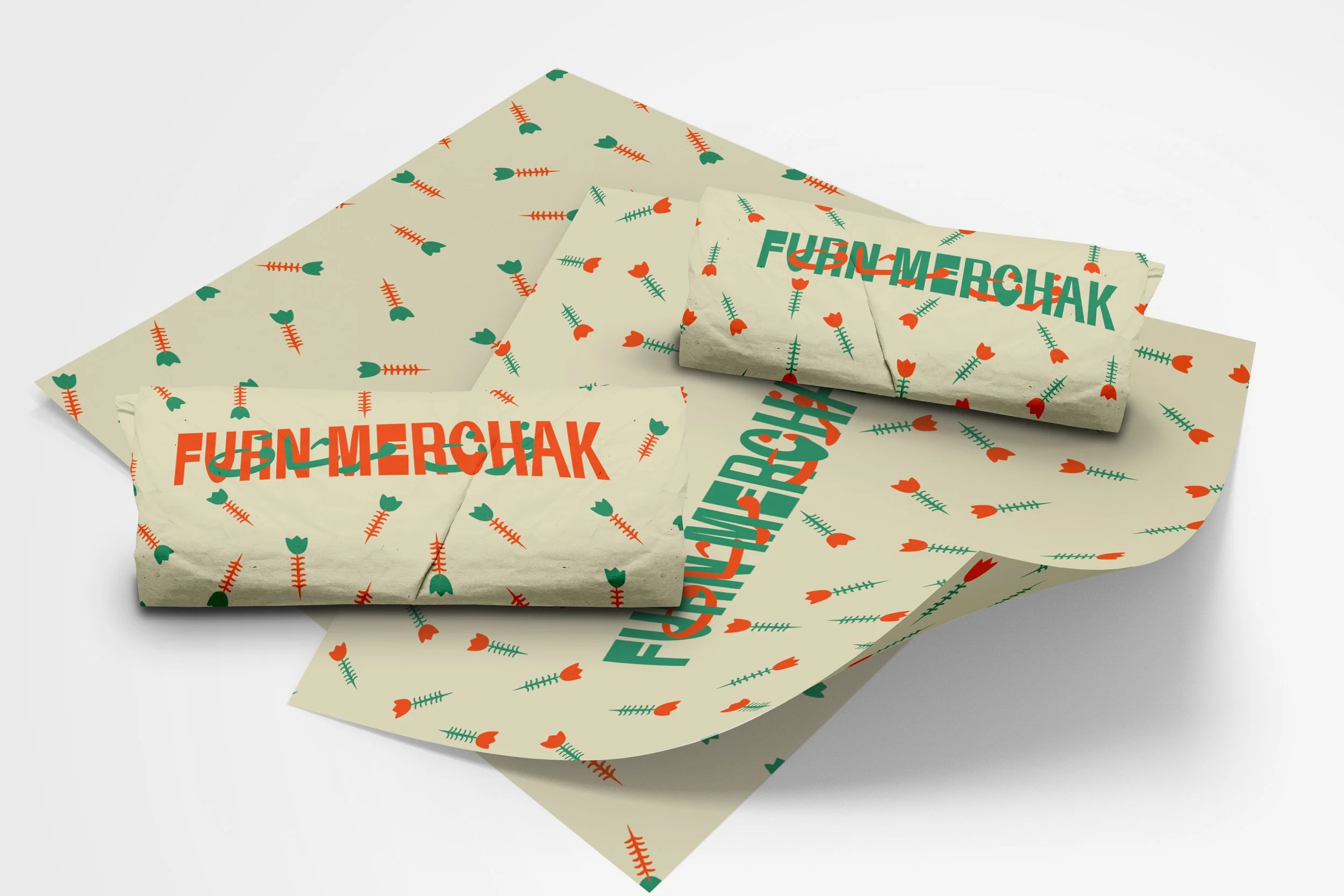
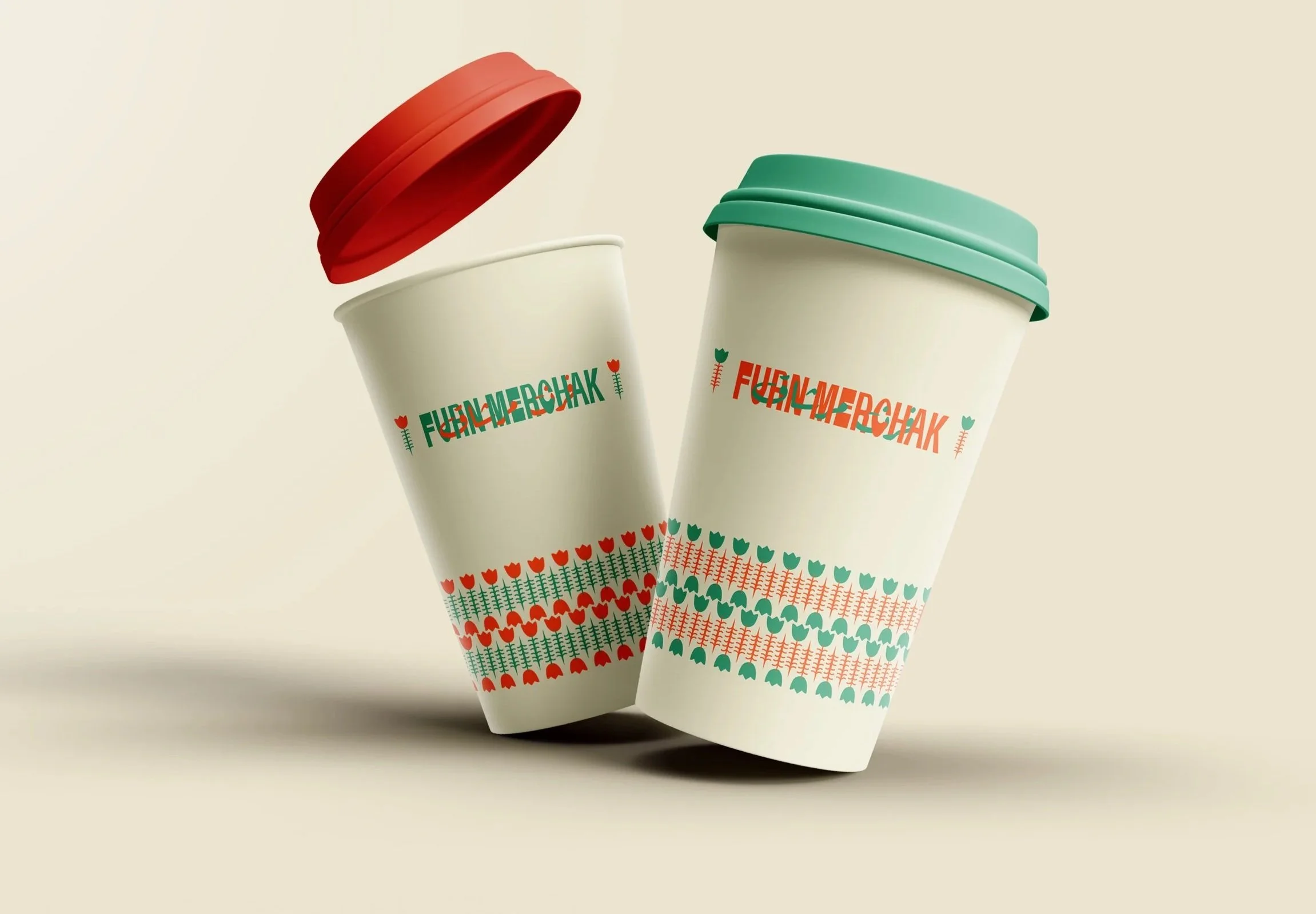
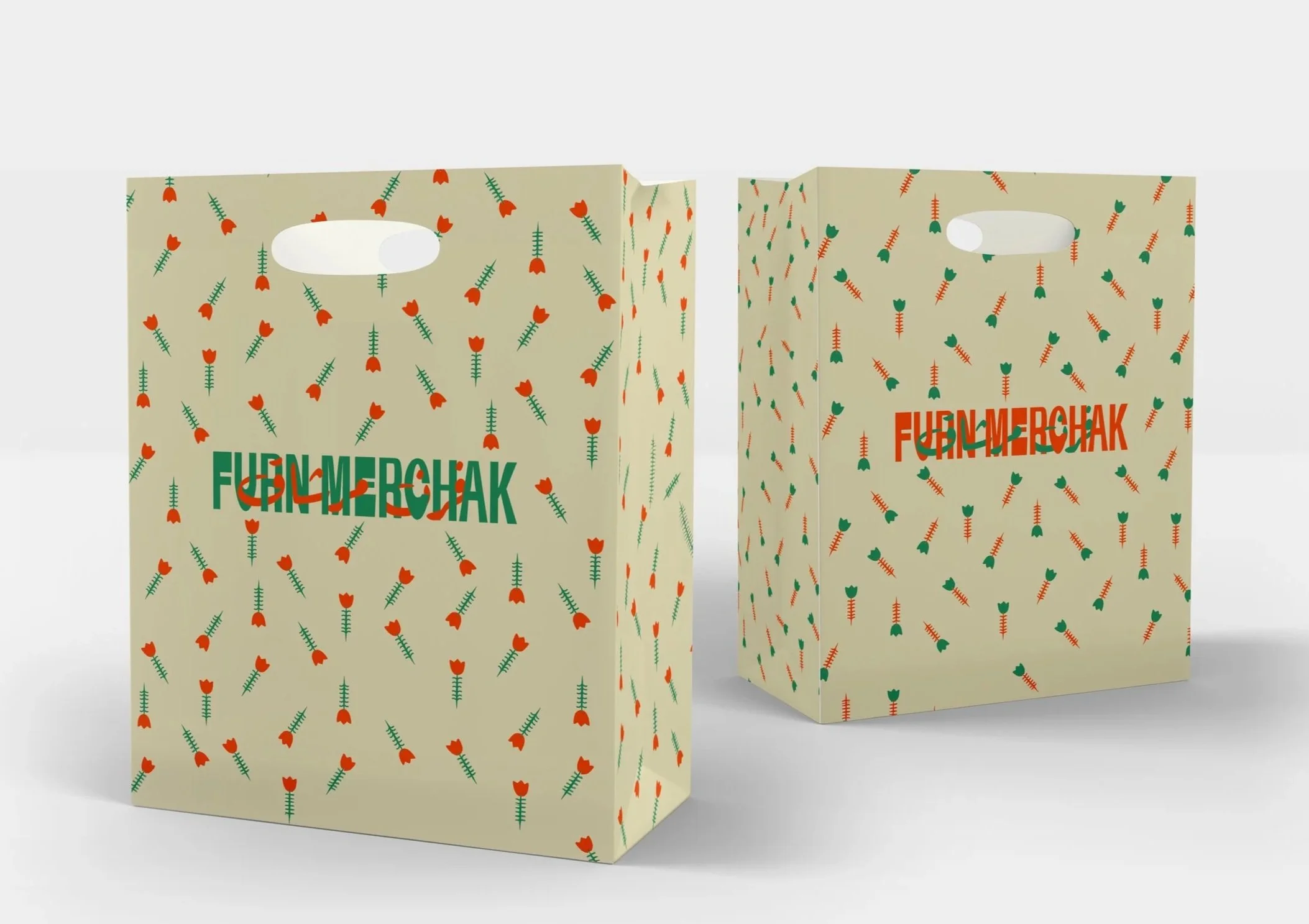
Furn Merchak Rebranding
Rebranding of a traditional Lebanese “Furn”

Mankouche is a very popular go-to for breakfast, lunch, or even snacks in Lebanon.
The target audience is basically everyone who lives close to the shop (Since there will be another one located within a 10-minute walk).
This place is located in one of the most popular streets of Beirut: Gemmayze.
Its architecture is very traditional, but it is very trendy, and all the coffee shops and bars are modern.
So the idea was to merge tradition with modernity.